Unable to find what you're searching for?
We're here to help you find itPurchase This Course
USD
View Fees Breakdown
| Course Fee | 1,150 |
|
Total Fees |
1,150 (USD) |
♱ Excluding VAT/GST
You can request classroom training in any city on any date by Requesting More Information
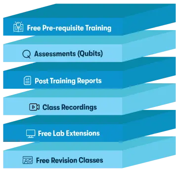
Inclusions in Koenig's Learning Stack may vary as per policies of OEMs
Scroll to view more course dates
You can request classroom training in any city on any date by Requesting More Information
♱ Excluding VAT/GST
*Inclusions in Koenig's Learning Stack may vary as per policies of OEMs
Data Visualization and Analysis with Python Packages